Nowadays a lot of emphases is laid upon exceptional presentation of data. All of this is because, when presented diagrammatically, data is easy to interpret with just a glance. In such a case we need to learn how to represent data diagrammatically via bar diagrams, pie charts etc.
Suggested Videos


Bar Diagrams
As the name suggests, when data is presented in form of bars or rectangles, it is termed to be a bar diagram.
Features of a Bar
- The rectangular box in a bar diagram is known as a bar. It represents the value of a variable.
- These bars can be either vertically or horizontally arranged.
- Bars are equidistant from each other.
- Each bar originates from a common baseline or a common axis.
- The width of bars remain same but the height changes, according to the value of a variable, to denote the difference between their values.
- Unless they are in a specific order, the convention is that bars can be arranged in an ascending or descending order.
Browse more Topics under Presentation Of Data
Types of Bar Diagrams
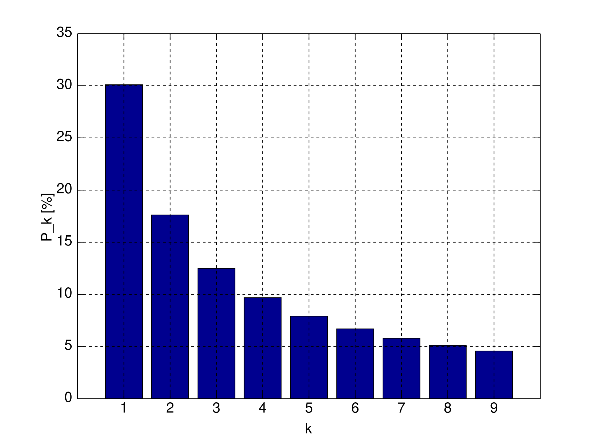
Simple Bar Diagram
These are the most basic type of bar diagrams. A simple bar diagram represents only a single set of numerical data. Generally, simple bar diagrams are used to represent time series data for a single entity.
Generally, the Y-axis contains markings which represent the range of the value of variable whereas the X-axis contains divisions for entities like years, time periods, areas etc.
Multiple Bar Diagram
Unlike single bar diagram, a multiple bar diagram can represent two or more sets of numerical data on the same bar diagram. Generally, these are constructed to facilitate comparison between two entities like average height and average weight, birth rates and death rates etc.
Separate sets of numerical data are differentiated with the help of colour variation. By the same token of simple bar diagrams, multiple bar diagrams also have divisions on Y-axis and X-axis that represent different values of the variable and entities like year, areas etc. respectively. Note that each division on X-axis has two or more bar diagrams each according to the specified number of bars.

Sub-divided or Differential Bar Diagrams
Sub-divided bar diagrams are useful when we need to represent the total values and the contribution of various sections of the total simultaneously. The different sections are shaded with different colours in the same bar.
For example, such a bar diagram can be used to represent the varying levels of employment over the years in India and each bar can be divided into two sectors, the urban and rural. Again, here the Y-axis and X-axis represent same values as in simple and multiple bar diagrams.
Percentage Bar Diagrams
This is derived further from the subdivided bar diagrams. In this, each bar has the same height that represents 100 percent of the Y-axis in totality. Further, each bar is divided into sections based on percentages calculated according to the contribution of these sections.
Percentage bar diagrams are used when the values are really high. This is because using subdivided bar diagrams in such cases would not be easy and appropriate.
Deviation Bar Diagrams
Lastly, the deviation bar diagrams are most interesting of the lot. In such a type of bar diagram, there are both negative and positive values on the y-axis. The deviation bar diagrams are used to compare the net deviation of related variables with respect to time and location.
For example, it can be used to represent a bar diagram for savings (represented by positive deviations) and deficit (represented by negative deviations) over years.

Pie or Circular Diagrams
In addition to bar diagrams, pie diagrams are also widely used to pictorially represent data. In this, a circle is divided into various segments which are decided on the basis of percentages. Which means the circle is divided into sectors depending on various percentages.
These sectors are differentiated with the help of colours. Pie diagrams have an edge over bar diagrams because they can easily provide an overview and provides a better sense of contributions of each part. The steps for construction of a pie diagram are:
The first step involves finding out respective percentages. This is done by a simple mathematical formula to find out percentages which is –
{(Parts for the respective sector)/total parts) ×100}.
For example, if in a class of 1oo students, 30 are obese, 20 are fat and 50 are slim then the percentages will be as follows:
(30/100)×100= 30%
(20/100)×100= 20%
(50/100)×100= 50%
2] A circle comprises 360 degrees. The angles that each sector will span across is decided by the given formula: (Percentage value/100)×360°
3] Finally, just plot these values according to their respective angles on a circle and give appropriate markings to complete the pie chart.
A Solved Example for You
Q: Which among the following is not a feature of a bar in the bar diagram?
- The width is same but the heights are generally different
- They are rectangular in shape
- Bars should not be equidistant
- Each bar originates from a common baseline
Ans: Of all the above options, option C is incorrect because conventionally the bars should be equidistant.


Leave a Reply