Diagrams play an important role in statistical data presentation. Diagrams are nothing but geometrical figures like lines, bars, circles, squares, etc. Diagrammatic data presentation allows us to understand the data in an easier manner.
Suggested Videos


Advantages of Diagrammatic Data Presentation
- Easy to understand – Diagrammatic data presentation makes it easier for a common man to understand the data. Diagrams are usually attractive and impressive and many newspapers and magazines use them frequently to explain certain facts or phenomena. Modern advertising campaigns also use diagrams.
- Simplified Presentation – You can represent large volumes of complex data in a simplified and intelligible form using diagrams.
- Reveals hidden facts – When you classify and tabulate data, some facts are not revealed. Diagrammatic data presentation helps in bringing out these facts and also relations.
- Quick to grasp – Usually, when the data is represented using diagrams, people can grasp it quickly.
- Easy to compare – Diagrams make it easier to compare data.
- Universally accepted – Almost all fields of study like Business, economics, social institutions, administration, etc. use diagrams. Therefore, they have universal acceptability.
Browse more Topics under Descriptive Statistics
- Definition and Characteristics of Statistics
- Stages of Statistical Enquiry
- Importance and Functions of Statistics
- Nature of Statistics – Science or Art?
- Application of Statistics
- Law of Statistics and Distrust of Statistics
- Meaning and Types of Data
- Methods of Collecting Data
- Census
- Sample Investigation
- Classification of Data
- Tabulation of Data
- Frequency Distribution of Data
- Graphic Presentation of Data
- Measures of Central Tendency
- Mean Median Mode
- Measures of Dispersion
- Standard Deviation
- Variance Analysis
Limitations of Diagrammatic Data Presentation

You need to exercise caution while drawing inferences from diagrams. Here are some of their limitations:
- Provides vague ideas – While diagrams offer a vague idea about the problem, it is useful only to a common man. An expert, who seeks an exact idea of the problem cannot benefit from them.
- Limited information – Classified and tabulated data provides more information than diagrams.
- Low precision – Diagram offer a low level of precision of values.
- Restricts further data analysis – Diagrams do not allow the user to analyze the data further.
- Portrays limited characteristics – Diagrams tend to portray only a limited number of characteristics. Therefore, it is difficult to understand a large number of characteristics using diagrams.
- A possibility of misuse – Sometimes diagrams are misused to present an illusory picture of the problem.
- Fail to present a meaningful look in certain situations – If the data has various measurements and wide variation, then diagrams do not present a meaningful look.
- Careful usage – If diagrams are drawn on a false baseline, then the user must analyze them carefully.
General Principles of Diagrammatic Presentation of Data
A diagrammatic presentation is a simple and effective method of presenting the information that any statistical data contains. Here are some general principles of diagrammatic presentation which can help you make them a more effective tool of understanding the data:
- Write a suitable title on top which conveys the subject matter in a brief and unambiguous manner. If you want to provide more details about the title, then you can mention them in the footnote below the diagram.
- You must construct a diagram in a manner that immediately impacts the viewer. Ensure that you draw it neatly with an appropriate balance between its length and breadth. Further, make sure that the diagram is neither too large nor too small. You can also use different colors or shades to emphasize different aspects of the problem.
- Draw the diagram accurately using proper scales of measurement. You should never compromise accuracy for attractiveness.
- Select the design of the diagram carefully keeping in view the nature of the data and also the objective of the investigation.
- If you use different shades or colors to depict the different characteristics in the diagram, then ensure that you provide an index explaining them.
- If you are using a secondary source, then ensure that you specify the source of data.
- Try to keep your diagram as simple as possible.
Types of Diagrams
There are many types of diagrams which are used for data presentation. Some popular types of diagrams are explained below:
Line Diagram
In a line diagram, you can represent different values using lines of varying lengths. Further, these lines are either horizontal or vertical. Also, there is a uniform gap between successful lines. You can use this when the number of items is very large. Here is an example:
Example 1
The income of 10 workers in a particular week was recorded as given below. Represent the data by a line diagram.
| Sr. no. of workers | 1 | 2 | 3 | 4 | 5 | 6 | 7 | 8 | 9 | 10 |
| Income (Rs.) | 240 | 350 | 290 | 400 | 420 | 450 | 200 | 300 | 250 | 200 |
The diagram is as follows:

Simple Bar Diagram
In order to draw a simple bar diagram, you construct horizontal or vertical lines who have heights proportional to the value of the item. You choose an arbitrary width of the bar but keep it constant. Also, ensure that the gaps between the bars are constant. This diagram is suitable to represent individual time-series or a spatial series. Here is an example:
Example 2
Represent the following data using a bar diagram:
| Years | 1993-94 | 1994-95 | 1995-96 | 1996-97 |
| Coffee Exports (‘0000 tonnes) | 13.67 | 13.73 | 17.06 | 18.12 |
The diagram is as follows:

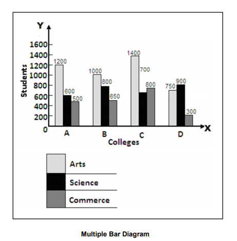
Multiple Bar Diagram
You can use a multiple bar diagram or a compound bar diagram when you want to show a comparison between two or more sets of data. You can draw a set of bars side-by-side, without gaps and separate the sets of bars with a constant gap. Further, you must color or shade different bars in a different manner. Here is an example:
Represent the following data on the faculty-wise distribution of students using a multiple bar diagram:
| College | Students | ||
| Arts | Science | Commerce | |
| A | 1200 | 600 | 500 |
| B | 1000 | 800 | 650 |
| C | 1400 | 700 | 800 |
| D | 750 | 900 | 300 |
The diagram is as follows:
Component or Sub-Divided Bar Diagram
In this diagram, you divide the bar corresponding to each phenomenon into various components. Therefore, the portion that each component occupies denotes its share in the total. You must ensure that the sub-divisions follow the same order and also that you use different colors or shades to distinguish them. You can use this diagram to represent the comparative values of different components of a phenomenon. Here is an example:
The following table gives the value of (A in Crores) of contracts secured from abroad, in respect of Civil Construction, industrial turnkey projects and software consultancy in three financial years. Construct a component bar diagram to denote the share of activity in total export earnings from the three projects.
| Years | 1994-95 | 1995-96 | 1996-97 |
| Civil Construction | 260 | 312 | 338 |
| Turnkey Projects | 442 | 712 | 861 |
| Consultancy Services | 1740 | 1800 | 2000 |
| Total | 2442 | 2824 | 3199 |
The diagram is as follows:

Circular or Pie Chart
A pie chart consists of a circle in which the radii divide the area into sectors. Further, these sectors are proportional to the values of the component items under investigation. Also, the whole circle represents the entire data under investigation.
Steps to draw a Pie Chart
- Express the different components of the given data in percentages of the whole
- Multiply each percentage component with 3.6 (since the total angle of a circle at the center is 360°)
- Draw a circle
- Divide the circle into different sectors with the central angles of each component
- Shade each sector differently
Use of Pie Chart
The use of pie charts is quite popular as the circle provides a visual concept of the whole. Pie charts are simple to use and hence are one of the most commonly used charts. However, the pie charts are sparingly used only for the following reasons:
- They are the best chart for displaying statistical information when the number of components is not more than 6. In the case of more components, the chart becomes too complex to understand.
- Pie charts are not useful when the values of the components are similar. This is because in the case of similarly sized sectors the viewer can find it difficult to differentiate between the slice sizes.
Here is an example:
Represent the following data, on India’s exports (Rs. in Crores) by regions from April to February 1997.
| Region | Europe | Asia | America | Africa |
| Exports | 32699 | 42516 | 23495 | 5133 |
From the table we have,
Total exports = 32699 + 42516 + 23495 + 5133 = Rs. 103, 843 crores
Europe = \( \frac{32699 × 360}{103843} \) = 113°
Asia = \( \frac{42516 × 360}{103843} \) = 147°
America = \( \frac{23495 × 360}{103843} \) = 82°
Africa = \( \frac{5133 × 360}{103843} \) = 18°

Solved Question
Q1. What are the advantages of diagrammatic data presentation?
Answer: The advantages of diagrammatic data presentation are:
- Diagrams are easy to understand
- You can represent huge volumes of data in a simplified manner
- They reveal hidden facts
- They quick to grasp and easy to compare
- Diagrams have a universal acceptability


Im trying to find out if my mother ALICE Desjarlais is registered with the Red Pheasant Reserve, I applied with Metie Urban Housing and I need my Metie card. Is there anyway you can help me.
Quite useful details about statistics. I’d also like to add one point. If you need professional help with a statistics project? Find a professional in minutes!