Have you noticed the display of some tables during the telecast of a cricket match or any sports match? These tables tell about the players or their comparison with others. Few tables have some block-like structure. Some blocks are higher than the others while some are of the same height. These tables-like representation of the information are the graphs. Here, we will study graphs, their types and the ways of construction. We will also study pictograph, barchart, pie chart etc.
Suggested Videos


Representation of Data
Suppose we have hundreds of thousands of collected data. How can we represent these data in an interesting way? This can be done by making pictograph, bar graph and pie-chart.
Browse more Topics under Smart Charts
Pictograph
In pictograph, we use pictures or symbols to represent data. A pictograph is an interesting way of making a comparison and analyzing data. A picture can have any numerical value. We can represent half of the value by making half pictures or symbols. Consider a data collection of the number of items sold during a sale in a week of a shop.
| Days | Number of Items Sold |
| Monday | # # # # # |
| Tuesday | # # # |
| Wednesday | # = |
| Thursday | # # = |
| Friday | # # |
| Saturday | # # # # |
| Sunday | # # # # # # |
‘#’ = 50 items ‘=’ = 25 items. Without doing the calculation, we say that the number of items sold was the maximum on Sunday. What was the number of items sold? The number = 6 # = 6 × 50 = 300. The number of the least sold items = (# + =) = 50 + 25 = 75.
You can download Smart Charts Cheat Sheet by clicking on the download button below


Barchart
A pictograph can be a time-consuming representation of data if the data are large in number. To overcome this problem, bar graphs are used. A barchart is the simplest representation of data. It is a graphical representation of the data in the form of rectangular bars or columns of equal width.
Properties of Bar Graphs
- Each bar or column in a barchart is of equal width.
- All bars have a common base.
- The height of the bar corresponds to the value of the data.
- The distance between each bar is the same.
Construction of a Bar Graph
- Draw two perpendicular lines intersecting each other at a point O. The vertical line is the y-axis and the horizontal is the x-axis.
- Choose a suitable scale to determine the height of each bar.
- On the horizontal line, draw the bars at equal distance with corresponding heights.
- The space between the bars should be equal.
The barchart for the example of the number of items sold during the sale is

Pie Chart
A pie chart is a circular representation of data. Here, data is represented by sector of a circle. The sectors of the circle are like the slices of a pie or pizza. The only difference is that in a pie chart the sectors are of different sizes. The size of each sector is related to its frequency.
Properties of Pie Charts
- The total angle of a circle is 360°.
- Each sector of the circle shows various observations of the data.
- The sum of the values of the observation is represented by the whole circle.
- The angle of the particular sector is calculated as ((Value of the component) ÷ Total value) × 360°.
- If the data is in percentage form, the angle of the sector becomes ((Percentage value of component) ÷ 100) × 360°. It shows the percentage distribution of the observations.
Construction of a Pie Chart
- Draw a circle of any radius.
- Calculate the angles of each sector by the above formula.
- Draw the various sectors.
- Colour each sector of your choice.
The pie chart for the example of the number of items sold during the sale is

We can calculate the angle of the sector as:
| Days | Number of Items Sold | Percentage of the No. of Item Sold (%) | Measure of Central Angles (°) |
| Monday | 250 | (250⁄1200) × 100 = 21 | (250⁄1200 × 360)° = 75° |
| Tuesday | 150 | (150⁄1200) × 100 = 13 | (150⁄1200 × 360)° = 45° |
| Wednesday | 75 | (75⁄1200) × 100 = 6 | (75⁄1200 × 360)° = 22.5° |
| Thursday | 125 | (125⁄1200) × 100 = 10 | (125⁄1200 × 360)° = 37.5° |
| Friday | 100 | (100⁄1200) × 100 = 8 | (100⁄1200 × 360)° = 30° |
| Saturday | 200 | (200⁄1200) × 100 = 17 | (200⁄1200 × 360)° = 60° |
| Sunday | 300 | (300⁄1200) × 100 = 25 | (300⁄1200 × 360)° = 90° |

Solved Examples for You
Question 1: What is the frequency of 20 marks if 15 students obtained 20 marks in a test?
Answer : The frequency of 20 marks is 15.
Problem: From the given bar-graph answer the following questions:
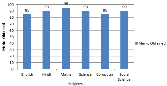
- In which subject the student scored the highest?
- What is the difference between the highest and the lowest marks?
- In how many subjects, the student got less than 90 marks?
- What is the total mark scored by the students?
Solution: From the bar graph,
- The student scored the highest marks in maths.
- The difference between the highest and the lowest marks = 95 − 90 = 10.
- Two subjects.
- The total marks = 85 + 90 + 95 + 90 + 85 + 90 = 535.
Question 3: Explain what is a bar graph in maths?
Answer: A bar graph refers to a chart that makes use of bars to show the various comparisons between categories of data. The bars can be either vertical or horizontal. Bar graphs with vertical bars are also known as vertical bar graphs.
Question 4: What are the characteristics that make a good bar graph?
Answer: The characteristics that make a good bar graph are as follows:
- Easy comparisons between different variables
- Clarity in displaying trends in data
- Easy determination in the value of a variable
Question 5: What are the various things that a bar graph must have?
Answer: The various things that a bar graph must have are as follows:
- visual structures
- axes and background
- scales and tick marks
- grid lines
- text
Question 6: Explain what is a simple bar graph?
Answer: A simple bar graph or chart is one that represents data involving only one variable classified on a temporal, quantitative, or spatial basis. In a simple bar chart, we make bars of equal width but the length is variable. Furthermore, the representation of a quantity’s magnitude takes place by the length or height of the bars.


Leave a Reply