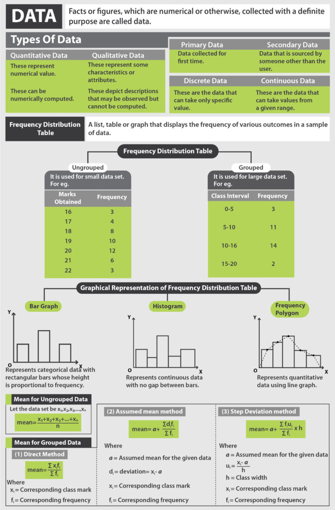
As we know, a picture speaks a thousand words. In the world of statics, graphs, in particular, are very important, as they help us make sense of the data and understand it better. So let us study the graphical representation of Cumulative Frequency Curve.
Videos
What is Cumulative Frequency?
The frequency is the number of times an event occurs within a given scenario. Cumulative frequency is defined as the running total of frequencies. It is the sum of all the previous frequencies up to the current point. It is easily understandable through a Cumulative Frequency Table.
| Marks | Frequency
(No. of Students) |
Cumulative Frequency |
| 0 – 5 | 2 | 2 |
| 5 – 10 | 10 | 12 |
| 10 – 15 | 5 | 17 |
| 15 – 20 | 5 | 22 |
Cumulative Frequency is an important tool in Statistics to tabulate data in an organized manner. Whenever you wish to find out the popularity of a certain type of data, or the likelihood that a given event will fall within certain frequency distribution, a cumulative frequency table can be most useful. Say, for example, the Census department has collected data and wants to find out all residents in the city aged below 45. In this given case, a cumulative frequency table will be helpful.
Download the Cheat Sheet of Statistics by clicking on the button below

Browse more Topics under Statistics
- Data
- Mean
- Median
- Mode
- Bar Graphs and Histogram
- Frequency Distribution
- Frequency Polygon
- Range and Mean Deviation
- Range and Mean Deviation for Grouped Data
- Range and Mean Deviation for Ungrouped Data
- Variance and Standard Deviation
Cumulative Frequency Curve

A curve that represents the cumulative frequency distribution of grouped data on a graph is called a Cumulative Frequency Curve or an Ogive. Representing cumulative frequency data on a graph is the most efficient way to understand the data and derive results.
Learn more about Frequency Polygon here.
There are two types of Cumulative Frequency Curves (or Ogives) :
- More than type Cumulative Frequency Curve
- Less than type Cumulative Frequency Curve
More Than Type Cumulative Frequency Curve
Here we use the lower limit of the classes to plot the curve.
How to plot a More than type Ogive:
- In the graph, put the lower limit on the x-axis
- Mark the cumulative frequency on the y-axis.
- Plot the points (x,y) using lower limits (x) and their corresponding Cumulative frequency (y)
- Join the points by a smooth freehand curve. It looks like an upside down S.
Learn more about Bar Graphs and Histogram here in detail.
Less Than Type Cumulative Frequency Curve
Here we use the upper limit of the classes to plot the curve.
How to plot a Less than type Ogive:
- In the graph, put the upper limit on the x-axis
- Mark the cumulative frequency on the y-axis.
- Plot the points (x,y) using upper limits (x) and their corresponding Cumulative frequency (y)
- Join the points by a smooth freehand curve. It looks like an elongated S.
Cumulative Graphs can also be used to calculate the Median of given data. If you draw both the curves on the same graph, the point at which they intersect, the corresponding value on the x-axis, represents the Median of the given data set.
Learn more about the Frequency Distribution here.
Solved Example for You
Q: From the given Less than frequency curve, calculate the frequency between 600 and 1000

Sol: By observing the graph, we can see that corresponding values for class intervals between the frequency
600 – 1000 = 16 – 10 = 6
Hence the frequency between said class intervals is 6.


Leave a Reply