The relevance of presentation of data in the pictorial or graphical form is immense. Frequency polygons give an idea about the shape of the data and the trends that a particular data set follows. Let us learn the step by step process of drawing a frequency polygon, with or without a histogram.
Suggested Videos


Presentation of Data
The key objective of statistics is to collect and organize data. One of the basics of data organization comes from presentation of data in a recognizable form so that it can be interpreted easily. You can organize data in the form of tables or you can present it pictorially.
Pictorial representation of data takes the form of bar charts, pie charts, histograms or frequency polygons. The benefit of this is that data in the visual form is easy to understand in one glance.
Download the Cheat Sheet of Statistics by clicking on the button below

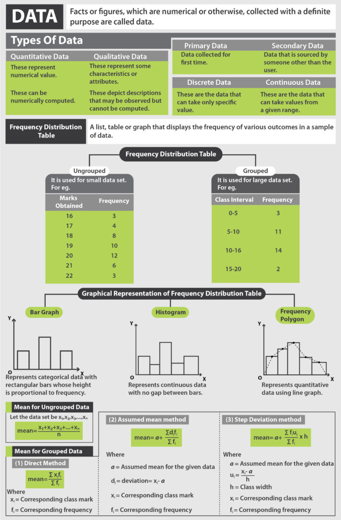
Frequency Polygon
A frequency polygon is a graphical form of representation of data. It is used to depict the shape of the data and to depict trends. It is usually drawn with the help of a histogram but can be drawn without it as well. A histogram is a series of rectangular bars with no space between them and is used to represent frequency distributions.
Steps to Draw a Frequency Polygon
- Mark the class intervals for each class on the horizontal axis. We will plot the frequency on the vertical axis.
- Calculate the classmark for each class interval. The formula for class mark is:
Classmark = (Upper limit + Lower limit) / 2
- Mark all the class marks on the horizontal axis. It is also known as the mid-value of every class.
- Corresponding to each class mark, plot the frequency as given to you. The height always depicts the frequency. Make sure that the frequency is plotted against the class mark and not the upper or lower limit of any class.
- Join all the plotted points using a line segment. The curve obtained will be kinked.
- This resulting curve is called the frequency polygon.
Note that the above method is used to draw a frequency polygon without drawing a histogram. You can also draw a histogram first by drawing rectangular bars against the given class intervals. After this, you must join the midpoints of the bars to obtain the frequency polygon. Remember that the bars will have no spaces between them in a histogram.
Solved Example for You
Question 1: Construct a frequency polygon using the data given below:
| Test Scores | Frequency |
| 49.5-59.5 | 5 |
| 59.5-69.5 | 10 |
| 69.5-79.5 | 30 |
| 79.5-89.5 | 40 |
| 89.5-99.5 | 15 |
Answer: We first need to calculate the cumulate frequency from the frequency given.
| Test Scores | Frequency | Cumulative Frequency |
| 49.5-59.5 | 5 | 5 |
| 59.5-69.5 | 10 | 15 |
| 69.5-79.5 | 30 | 45 |
| 79.5-89.5 | 40 | 85 |
| 89.5-99.5 | 15 | 100 |
We now start by plotting the class marks such as 54.5, 64.5, 74.5 and so on till 94.5. Note that we will also plot the previous and next class marks to start and end the polygon, i.e. we plot 44.5 and 104.5 as well.
Then, the frequencies corresponding to the class marks are plotted against each class mark. Like you can see below, this makes sense as the frequency for class marks 44.5 and 104.5 are zero and touching the x-axis. These plot points are used only to give a closed shape to the polygon. The polygon looks like this:

(Source: Stats LibreTexts)
Question 2: Explain how to construct a frequency polygon?
Answer: In order to create a frequency polygon, one must follow these steps:
- Creation of a histogram.
- Finding the midpoints for each bar that exists on the histogram.
- Placing a point on the origin of the histogram and its end.
- Connection of the points.
Question 3: Explain what is a frequency polygon?
Answer: The frequency histogram has the similarity to a column graph without the presence of spaces between columns. The frequency polygon happens to be a special line graph whose use takes place in statistics. One can draw these graphs either separately or combined. One can make use of the information that is available in a frequency distribution table for drawings of these graphs.
Question 4: Differentiate between a frequency polygon and frequency curve?
Answer: The major difference between a frequency polygon and frequency curve is that the drawing of a frequency polygon by joining points by a straight line while the drawing of a frequency curve takes place by a smooth hand.
Question 5: What can you learn from a frequency polygon?
Answer: Frequency polygons provide us with an understanding of the shape of the data and its trends.


Leave a Reply