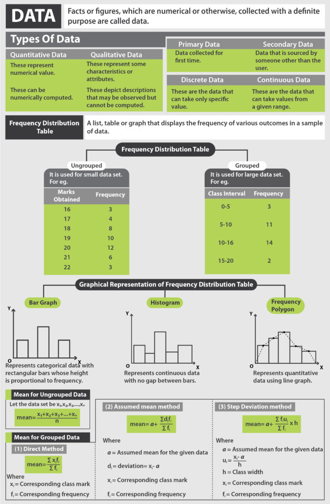
What is a bar chart? What is a histogram? These are a diagrammatic representation of data. The use of tabular data and graphs and charts makes it easy to understand the concept of bar charts and histograms. In this lesson, we will learn definitions and examples on how to draw a bar chart and a histogram.
Suggested Videos


Diagrammatic Representation of Data
Data can be presented in the form of organized information, combined in tables or even graphically represented. Imagine seeing a set of data in the written form or in tabular form versus a graph that gives you the same information. Isn’t it simpler and quicker to comprehend data if we can visually see it?
It is for this purpose that data can be organized graphically for interpretation in a single glance in Statistics. The two forms of graphical representation that we shall cover in this lesson are bar diagram and histogram.
Download the Cheat Sheet of Statistics by clicking on the button below

Browse more Topics under Statistics
- Data
- Mean
- Median
- Mode
- Cumulative Frequency Curve
- Frequency Distribution
- Frequency Polygon
- Range and Mean Deviation
- Range and Mean Deviation for Grouped Data
- Range and Mean Deviation for Ungrouped Data
- Variance and Standard Deviation
Bar Diagram
Also known as a column graph, a bar graph or a bar diagram is a pictorial representation of data. It is shown in the form of rectangles spaced out with equal spaces between them and having equal width. The equal width and equal space criteria are important characteristics of a bar graph.
Note that the height (or length) of each bar corresponds to the frequency of a particular observation. You can draw bar graphs both, vertically or horizontally depending on whether you take the frequency along the vertical or horizontal axes respectively. Let us take an example to understand how a bar graph is drawn.
| Sports | No. of Students |
| Basketball | 15 |
| Volleyball | 25 |
| Football | 10 |
| Total | 50 |
The above table depicts the number of students of a class engaged in any one of the three sports given. Note that the number of students is actually the frequency. So, if we take frequency to be represented on the y-axis and the sports on the x-axis, taking each unit on the y-axis to be equal to 5 students, we would get a graph that resembles the one below.
The blue rectangles here are called bars. Note that the bars have equal width and are equally spaced, as mentioned above. This is a simple bar diagram.
 Histogram
A bar diagram easy to understand but what is a histogram? Unlike a bar graph that depicts discrete data, histograms depict continuous data. The continuous data takes the form of class intervals. Thus, a histogram is a graphical representation of a frequency distribution with class intervals or attributes as the base and frequency as the height.
The key difference is that histograms have bars without any spaces between them and the rectangles need not be of equal width. So, we will understand histograms using an example.

In this case, see that we are considering class intervals such as 0-5, 5-10, 10-15 and 15-20. These are continuous data. In case, the class intervals given to you are not continuous, you must make it continuous first.
Here, you can interpret the histogram using the information that the graph gives. Consider the frequency to be as given on the left vertical axis and ignore the values on the right vertical axis. Thus, for the class interval 0-5, the corresponding frequency is 3. Again, for 5-10, the frequency is 7, and so on.
Note that we have taken the simple case of a histogram with bars of equal width. But as mentioned, it might not be the case if the class intervals are not even in size. In that case, you will get a histogram with bars stuck to each other (without any space between them) but with different widths. It could look something like this, but exactly how it will look depends on the data:

Solved Example for You
Question: What is a histogram and distinguish between a histogram and a bar chart.
Answer: A histogram is a graphical representation of a frequency distribution with class intervals or attributes as the base and frequency as the height.
| Parameter | Bar Chart | Histogram |
| Definition | Pictorial representation in the form of spaced bars to depict numerical data. | The graphical representation in the form of bars with no spaces between them to depict frequency distributions. |
| Type of data | Represents categorical data. | Represents quantitative data. |
| Spaces | Equally spaced bars. | No spaces between bars. |
| Width | Equal width. | Width may vary. |
Question. Explain the use of histogram?
Answer. The histogram gives us a visual representation of data distribution. Furthermore, histograms facilitate in the display a massive amount of data along with the frequency of the data values. Moreover, one can determine the median and distribution of the data by making use of a histogram.
Question. Explain the difference between the histogram and bar charts?
Answer. A histogram shows us the frequency distribution of continuous variables. In contrast, a bar graph refers to a diagrammatic comparison of discrete variables. The histogram represents numerical data whereas the bar graph represents categorical data.
Question. How can one make a histogram?
Answer. In order to make a histogram, one must follow the following steps:
- One must place frequencies on the vertical axis. Furthermore, one must label this axis “Frequency”.
- One must place the lower value of each interval on the horizontal axis.
- Finally, one must draw a bar that extends from the lower value of each interval to the lower value of the next interval.
Question. What is meant by a histogram graph?
Answer. A histogram refers to a display of statistical information. In this display, rectangles to show the frequency of data items.


Leave a Reply